KaTE McManuS
Landing pages from 4 different interactive articles and tools

Interactive Articles

  1. Google
  2. UX Design, Data Viz
  3. 2019

Overview

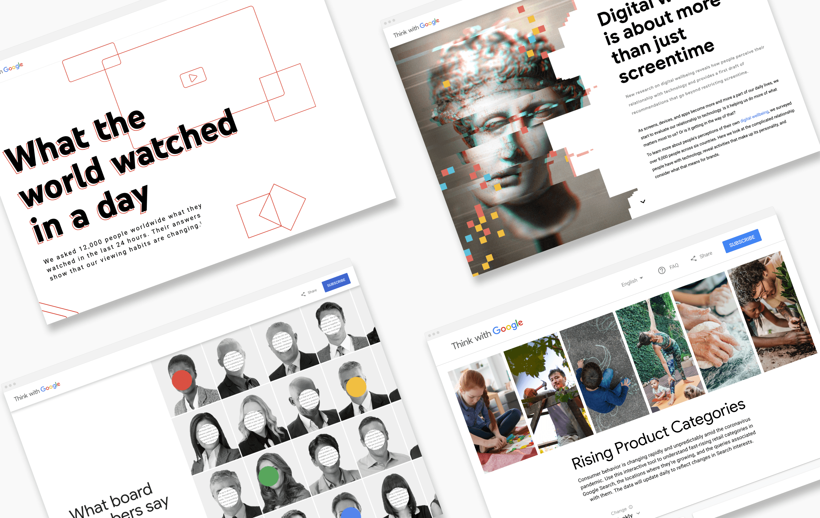
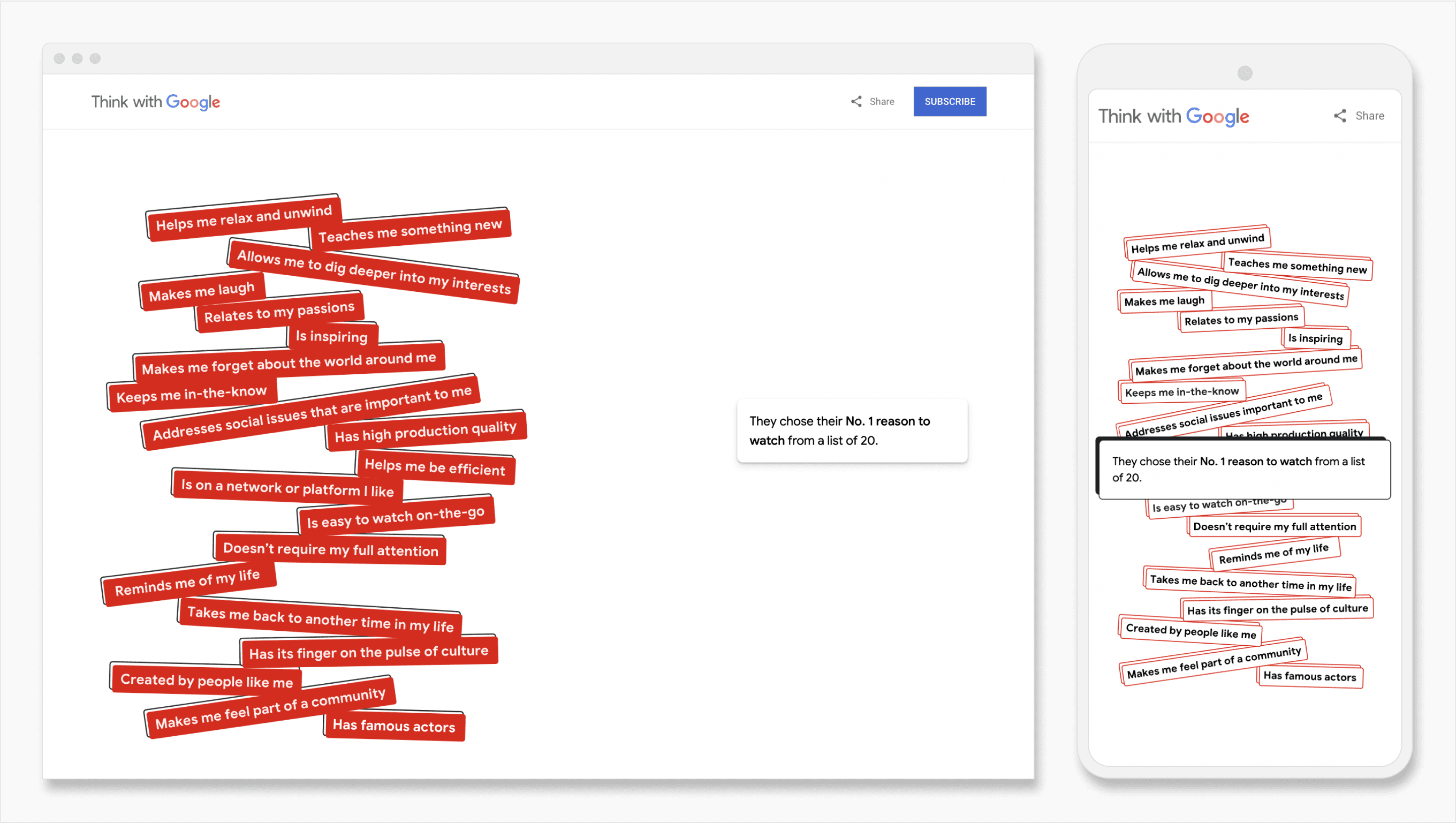
Think with Google (TwG), a B2C/B2B consumer insights driven marketing group and thought leader, publishes content on marketing research and digital trends. TwG's interactive articles received up to 3x more unique page views than their most popular standard articles. To build out their platform with more of these delightful digital experiences, I was brought on to lead UX Design and Data Visualization. Our team ensured responsive, best-in-class storytelling, at times for audiences across 50+ countries. The interactive articles and tools we produced increased engagement rate and time users spent on-site(4+ minutes vs. 2.3 minute TwG average).

Early work

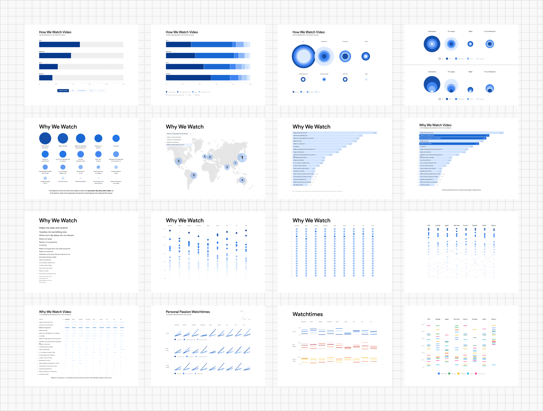
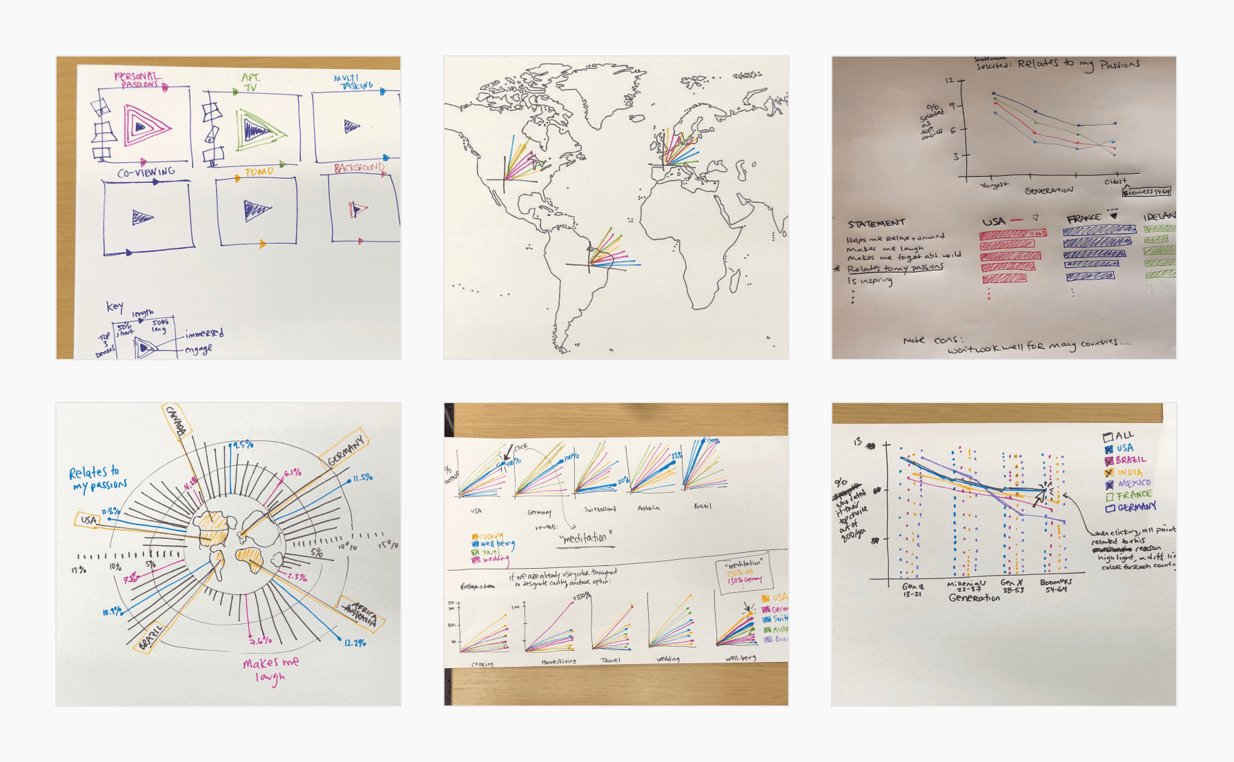
I started by familiarizing myself with the data and the story it told. This often entailed combing through spreadsheets and creating graphs. This stage was also very collaborative, brainstorming with product, copy, visual design, or the researchers who ran the studies, during which rough visualizations were a helpful reference. We often drafted early ideas on paper.

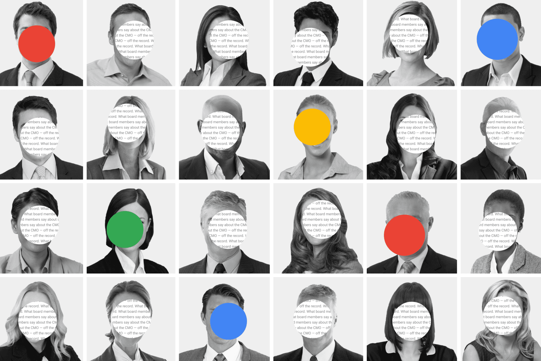
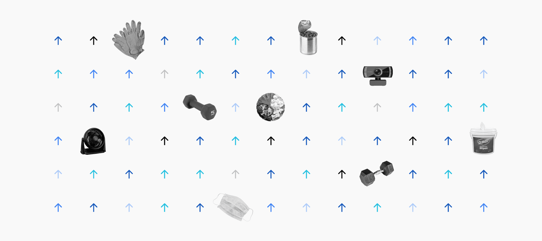
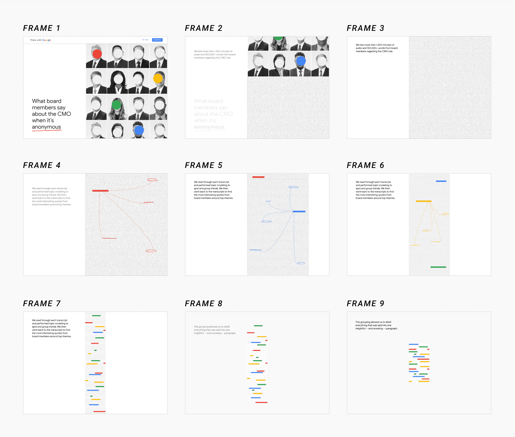
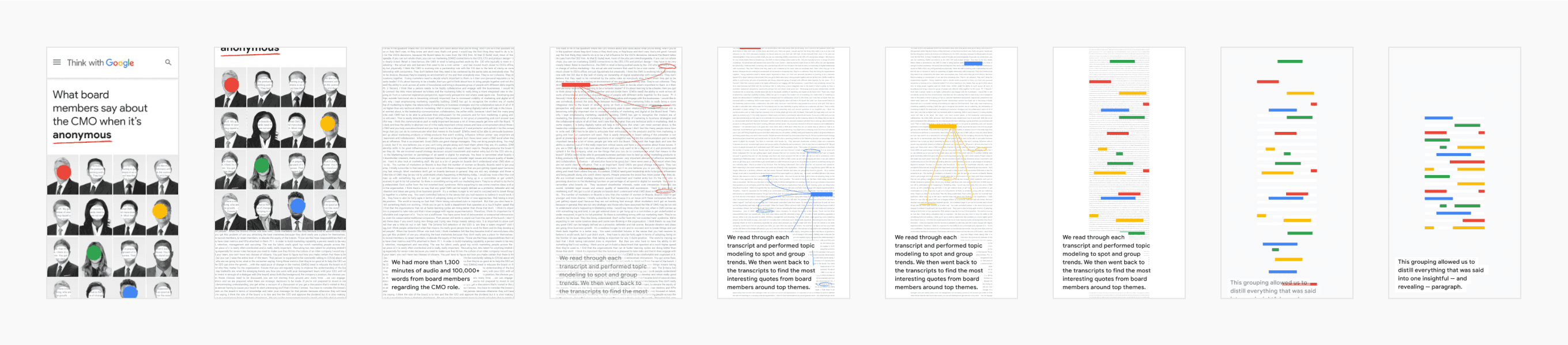
We also experimented with various visual styles. We were guided by the article's core themes, such as anonymity for a piece about CMOs (“What board members say about the CMO—off the record”). “What the World Watched in a Day” was a YouTube piece, so we leaned into their brand colors: red, black, and white. We later moved away from the initial use of a red background due to accessibility.

Exploratory visualizations for the interactive “What the World Watched in a Day”
Brainstorming visualizations for the interactive “What the World Watched in a Day”
When creating visuals for the interactive ”What board members say about the CMO—off the record,” we leaned into the theme of anonymity.
For an early iteration of a YouTube interactive (“What the World Watched in a Day”), we leaned into their brand colors. We later moved away from this visual design due to problems with accessibility.
An unused visual I created as an option for the hero of Rising Retail Categories, an interactive tool by Think with Google. (Early in the pandemic, we temporarily released this tool to help retailers understand trending consumer products in Google Search.)

Storyboarding

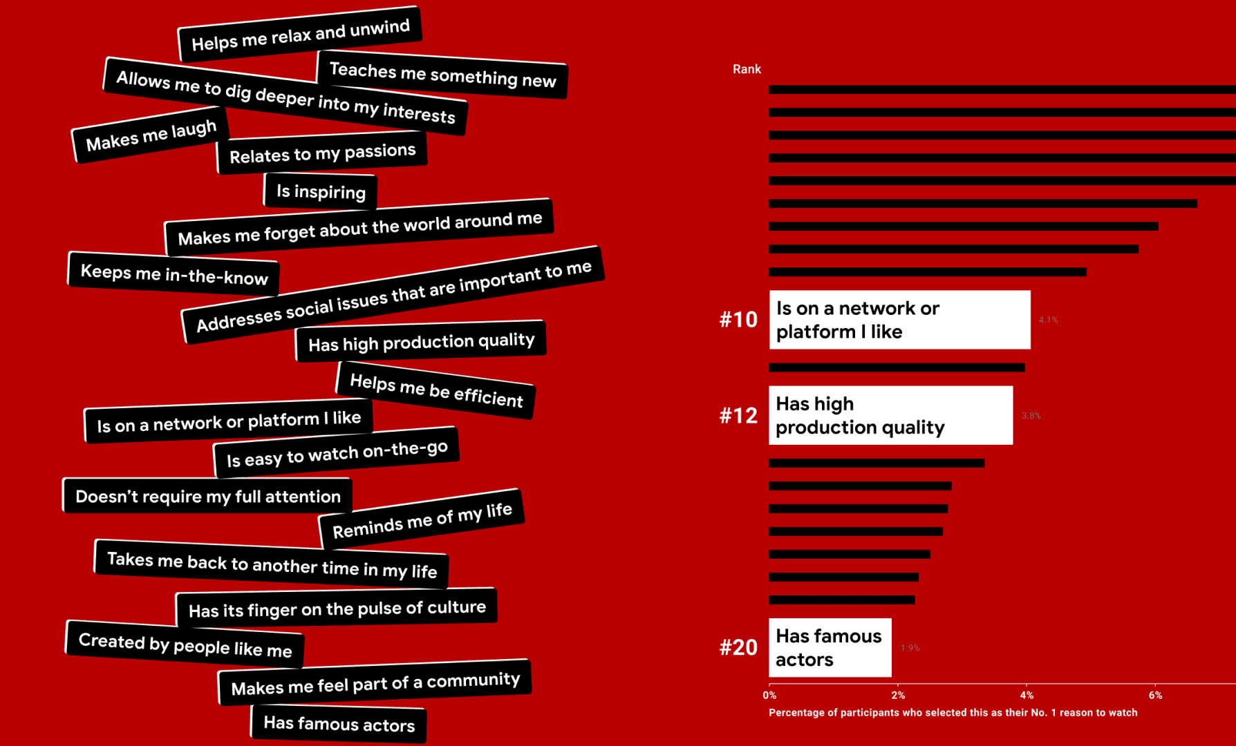
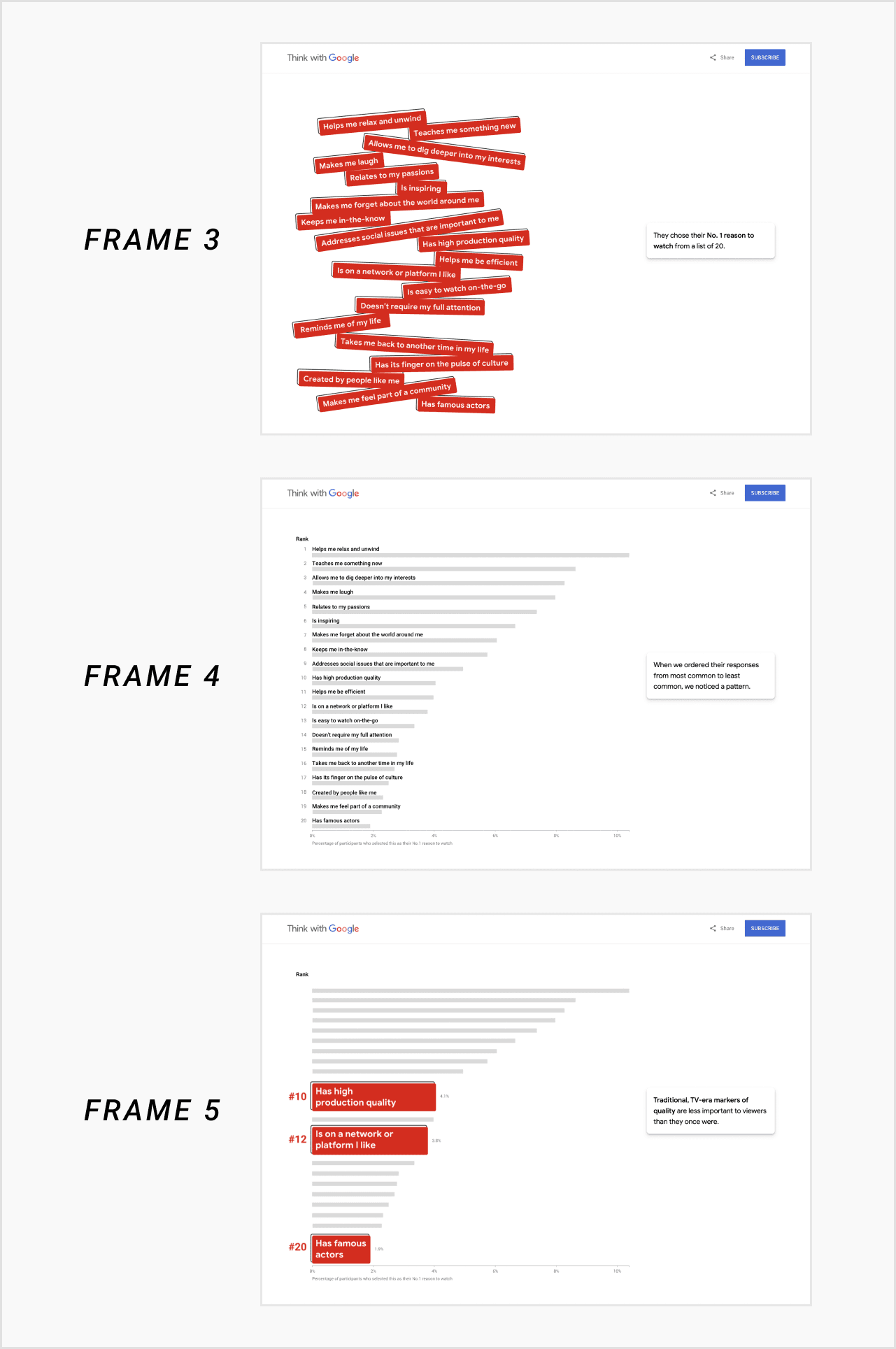
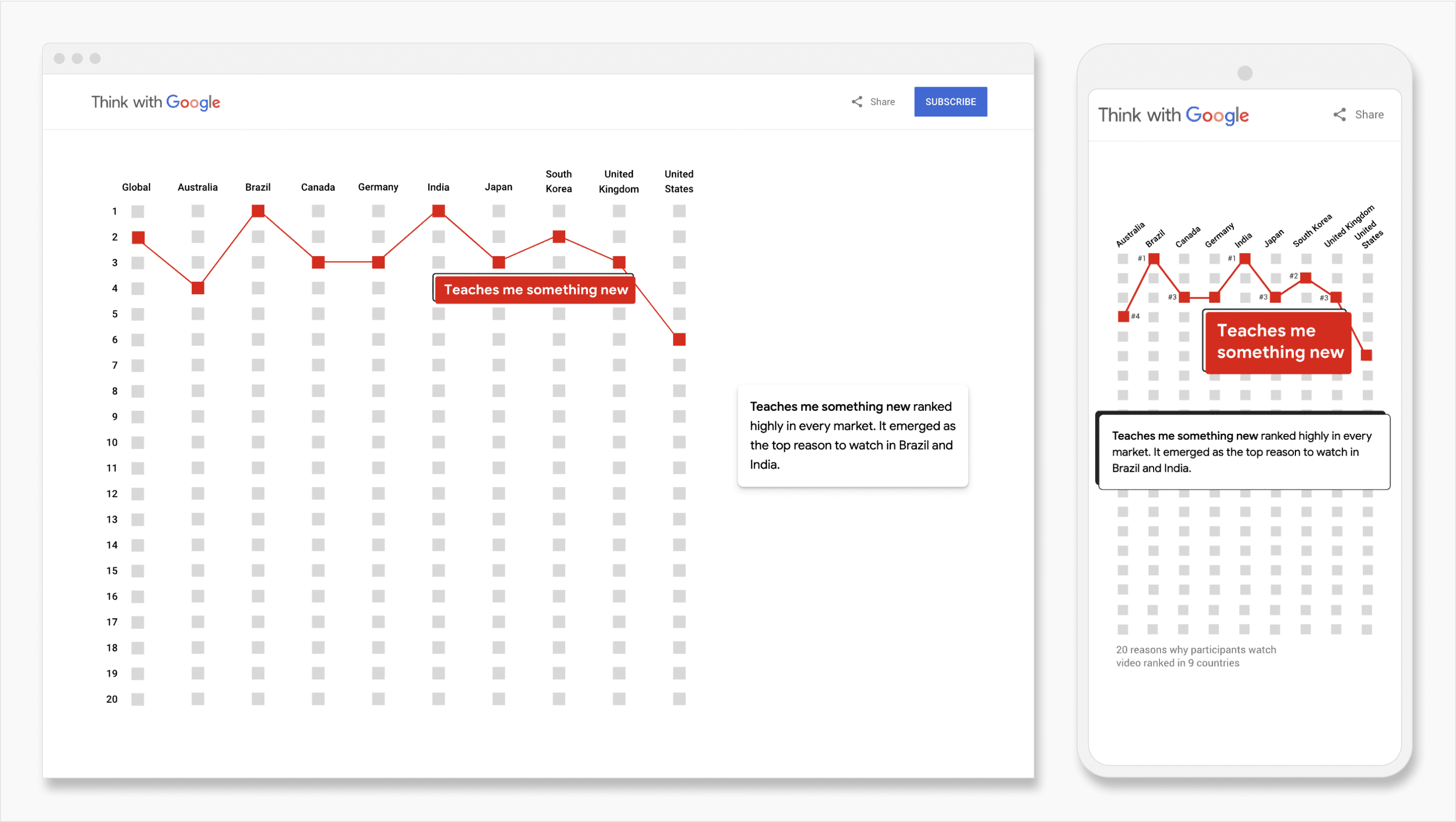
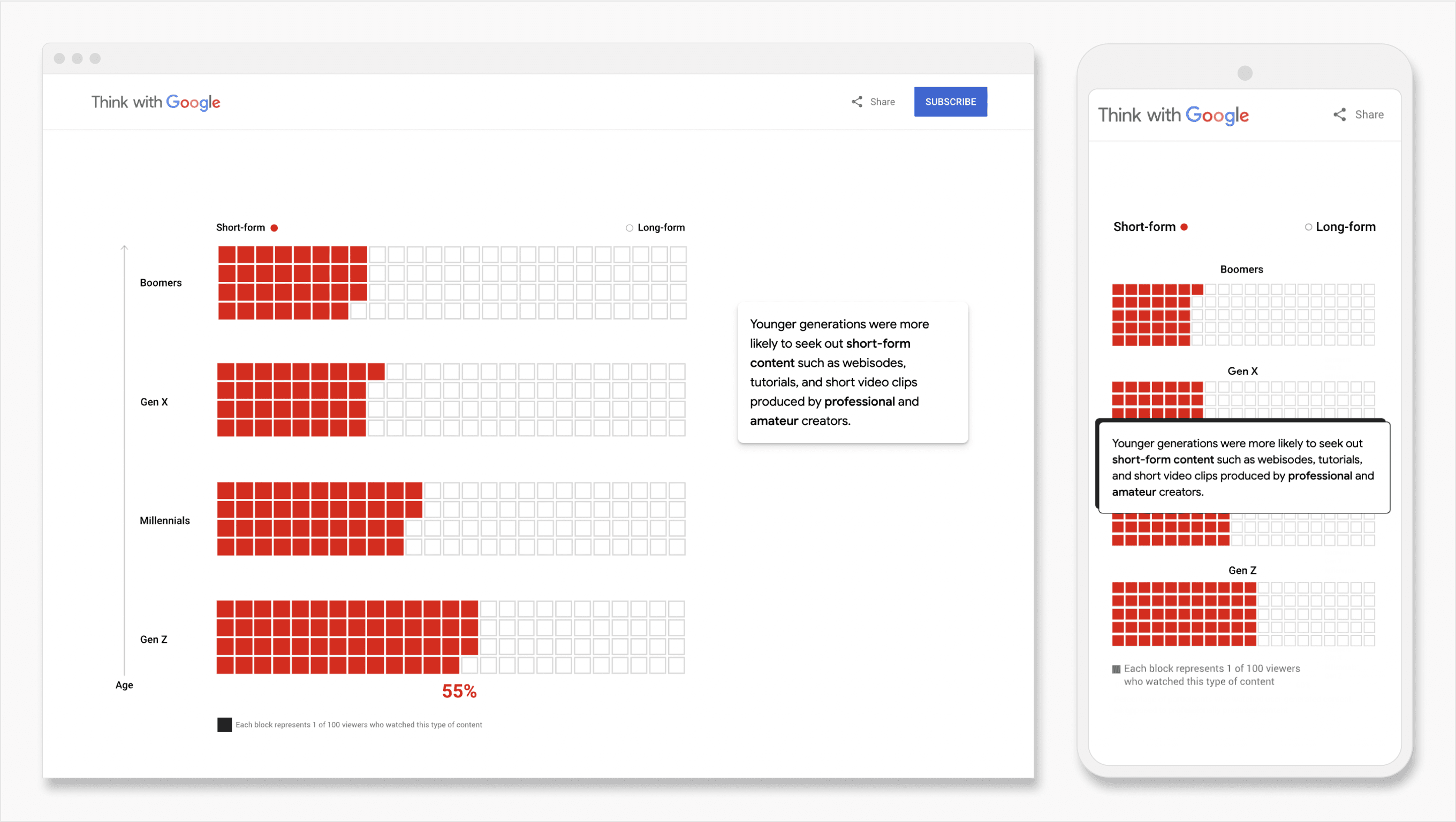
Creating storyboards helped us lay out core elements, like if the piece would be author-driven or user-driven. For “What the World Watched in a Day,” we had heaps of data. We were concerned it could overwhelm users if we expected them to make sense of it without guidance. Plus, in our initial investigation, a clear story had emerged from the data. This led us to design an author-driven experience, where we presented the most interesting charts in a “scrolly” design; textboxes narrated charts as they were revealed. For our piece on Digital Wellbeing, we opted for a hybrid approach. We introduced the graph with a summary of the researchers' findings. Directly below it, we opened the graph up to the user for exploration through interaction.

Responsive design

Strong UX across devices was foundational. With bespoke, complex charts, it was often challenging to fit all the information into view on mobile devices. This was especially true for “What the World Watched in a Day” because we used a “scrolly” design. This style allowed us to animate elements (e.g. textboxes), into view on scroll. However, it also restricted our ability to use scroll as it typically works: to reveal more of the page. With a “scrolly,” all page elements must fit on one screen.

We also didn't want to limit the possibilities available on desktop, such as adding detail, hover interactions, etc. The magic was in ensuring the translation from mobile to desktop was seamless, lovely, and playing to the strengths of the respective device.

Copy outlined frame by frame for “What the World Watched in a Day”
Charts, corresponding to the copy outline, laid out frame by frame for “What the World Watched in a Day”
In this author-driven “scrolly” design, as the user scrolls, textboxes narrate the animated charts.
In the Digital Wellbeing interactive, the data is introduced with a summary of the researchers' findings. Next, users can explore the data for themselves.
Font size, and therefore legibility, decreases on smaller screens. To counter this, the text's background is white, instead of red, on mobile devices.
On smaller screens, textboxes overlap with charts to save space. As users control the textbox's position with scroll, they can always remove any obstruction to an area that interests them.
While the two designs are largely identical, larger screens allowed for the addition of supplementary details.
Each video illustrates different aspects of the Digital Wellbeing interactive's mobile design. The first video displays the introduction of the data. The second demonstrates the handling of text overflow for “Activities” with many characters. The third shows how users explore the data by scrolling the “Activities.” (On desktop, this interaction works with hover.)
On desktop, users reveal occluded text and related quotes by hovering. On mobile, users must tap on the occluded text, swipe on the pop-up to reveal more quotes, and tap outside of the pop-up to return to the paragraph.

Implementation

I always push to meet with developers soon as I have a general idea of the design approach in order to receive feedback on feasibility and other technical considerations. When elements of the design are flexible, it's helpful to collaborate to determine solutions that work best for everyone. For example, in our piece on CMOs, I'd only created storyboards for the opening animation. The project's developer, a strong animator, wanted to flesh out the transitions himself, and the final animation was stronger for it.

When engineers provide a staging link to view the first draft, this often entails simply highlighting discrepancies from the designs. However, sometimes interacting with the content revealed unforeseen issues. For example, when observing users interact with the initial implementation of the CMO piece, we noticed many entirely missed that the colorful, occluded textboxes in the paragraph were hoverable. To solve this, we introduced a slight quiver animation to interactable elements. The animation cycles until a user successfully initiates a reveal.

Team

Product: Casey Fictum; Copy: Marianna Nash; Design: Tim McAuliffe; Production: Jenny Maughan; Development: Grow (Agency)

For the interactive about CMOs, I used this frame-by-frame storyboard of the introductory animation to collaborate with the project's developer.
Like the previous image, this is a storyboard for the CMO interactive, but it features mobile designs.
The introductory animation for “What board members say about the CMO—off the record” on desktop and mobile. You can see how the final result evolved beyond the original storyboards above.
To address the issue of users not understanding that the occluded text elements in the paragraph are interactable, we added a quiver animation. The animation cycles until a user interacts.