Visual Stories
- UX/UI Design
- 2020-2022
Overview
As the pandemic took hold, at Think with Google (TwG), information evolved so rapidly that articles from the week before could feel stale, even out-of-touch. Our Interactive Articles took 2+ weeks to launch, so producing them no longer made sense. Many marketers and retailers were struggling, and we needed to deliver relevant data to them more quickly than ever.
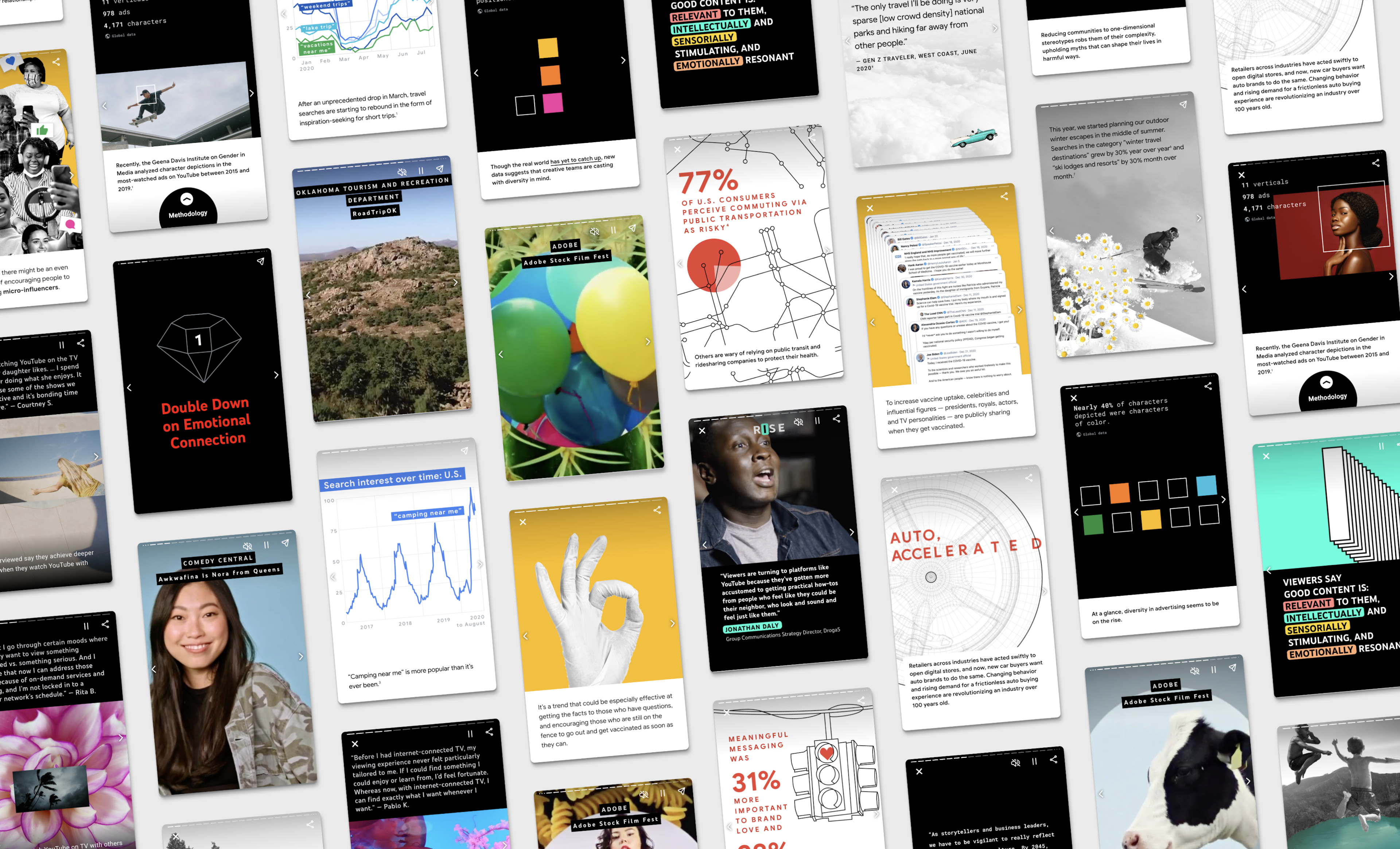
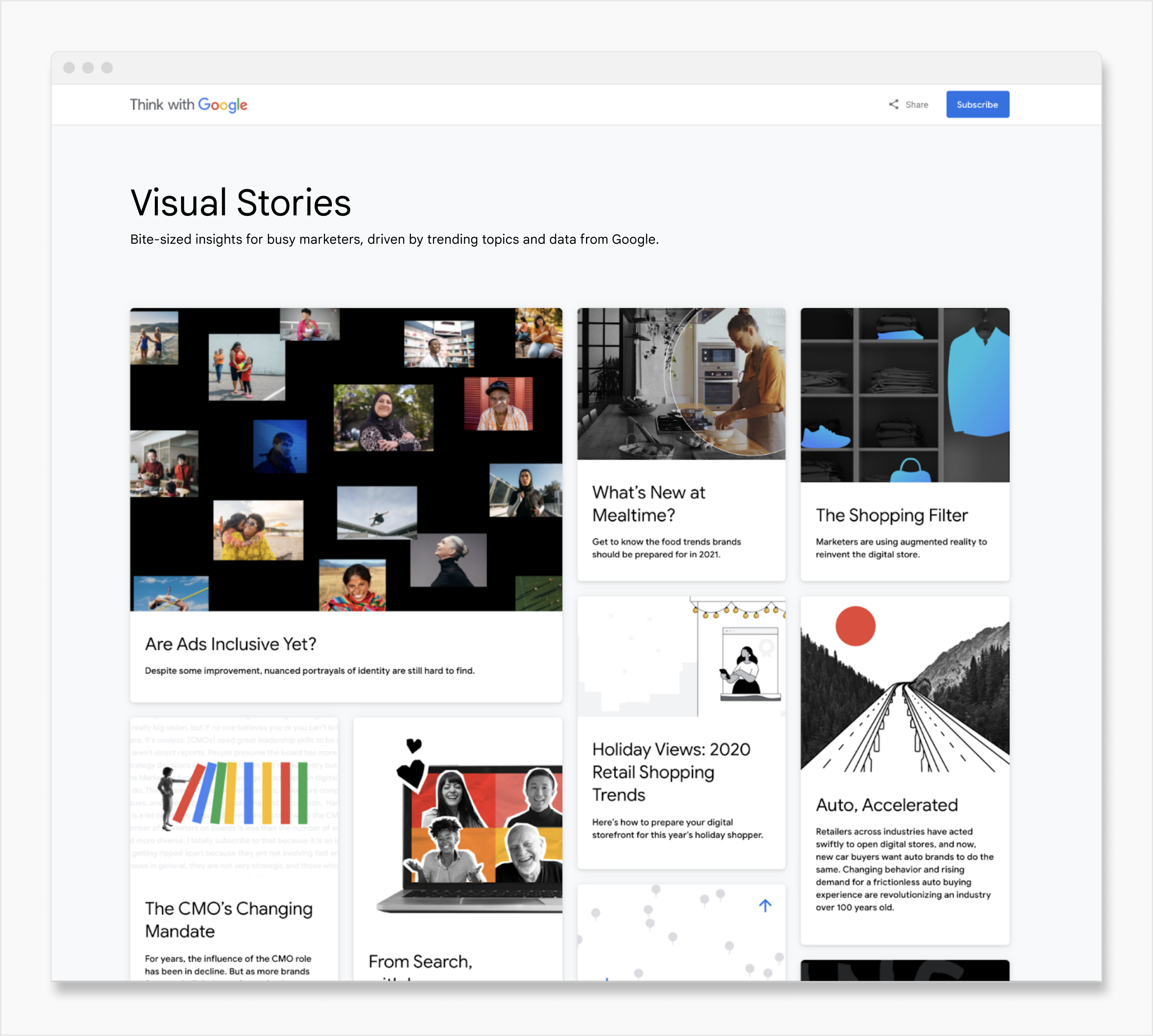
Site metrics also showed a shift in the way users consumed platform content, from desktop to mobile. Now, nearly 75% of users were accessing the platform from their phones, and they were seeking more bite-sized content. To meet their needs without sacrificing visually-rich, data-driven storytelling, we launched Visual Stories.Inspired by “stories” on social media apps, Visual Stories are mobile-first, full-bleed, tappable articles. They were originally available through a custom TwG product page, which we designed as a vibrant board.
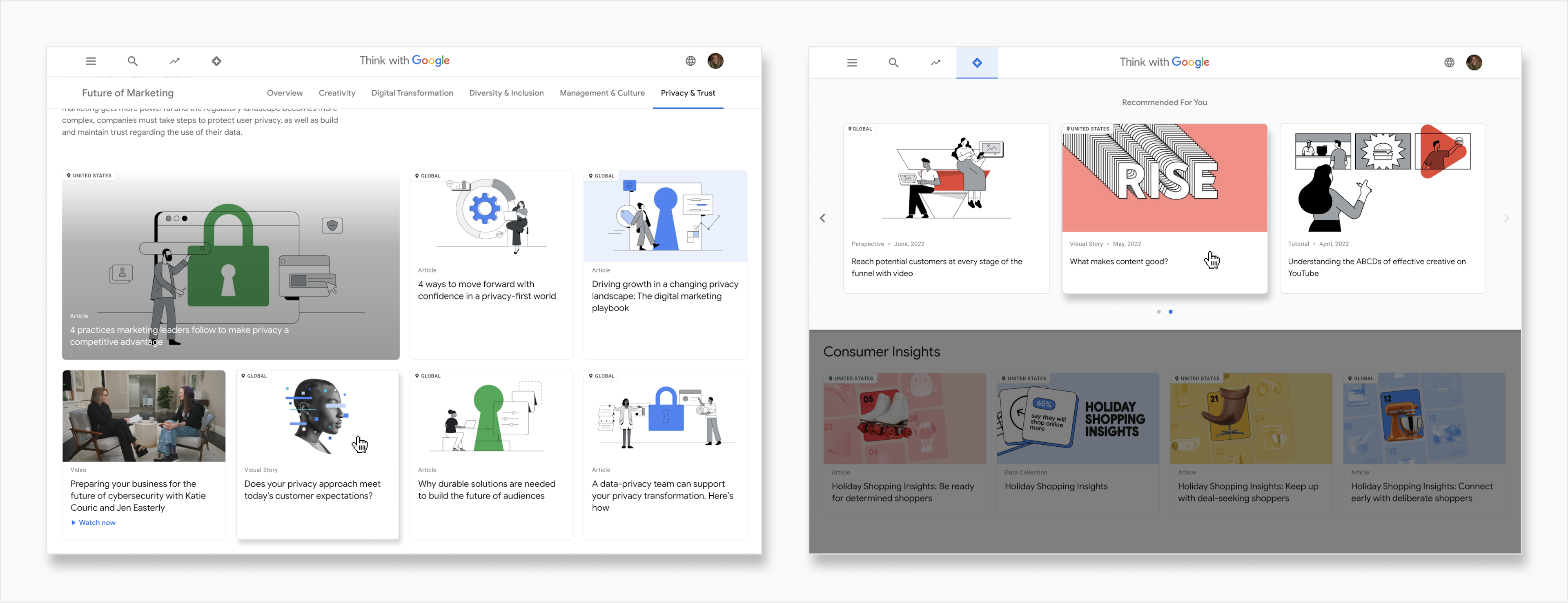
As they grew to be a site staple, we integrated Visual Stories into the TwG platform as a core content type, translated across 18 languages. To facilitate the creation of Visual Stories by teams throughout the larger Google Marketing organization, we setup an internal editor.
Team
Design: Kelly Sullan, Grow (Agency); Product: Casey Fictum; Production: Jenny Maughan; Development: Victor Zeng, Grow (Agency)
Original product ux/ui
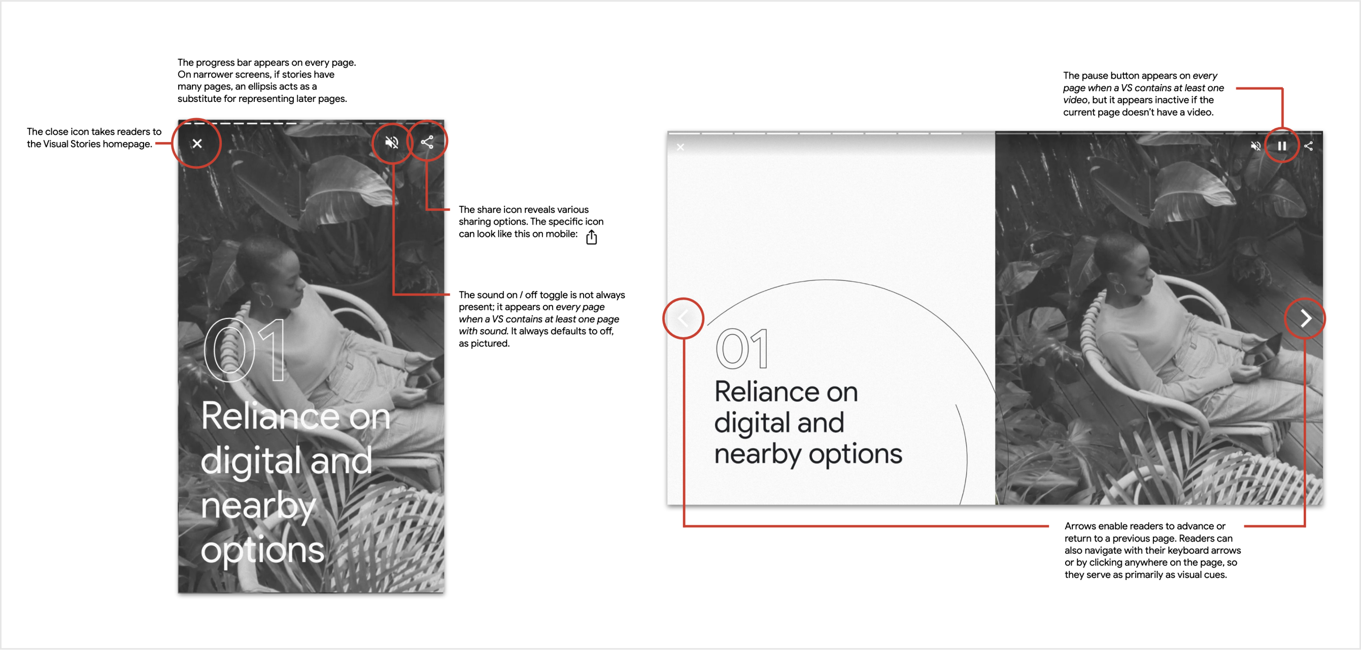
We built the original Visual Stories from the ground up. This encompassed the UX/UI of the new article type. If this project had had a less urgent timeline, I would have advocated more for UX research to test our designs. In lieu of research, we collected an archive of articles in this style from other publications. We studied their decisions, considering elements from navigation arrows to the progress bar. One strength we cherry-picked was the inclusion of a larger, more pronounced arrow on a story's first page. We added descriptive text (“NEXT”) and a pulsing animation to catch users' attention. It was critical that they understood how to advance to the next page. On the following pages, when the behavior was learned, the arrows receded.
Responsive templates
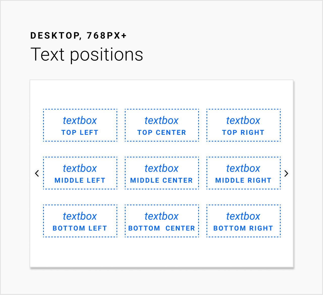
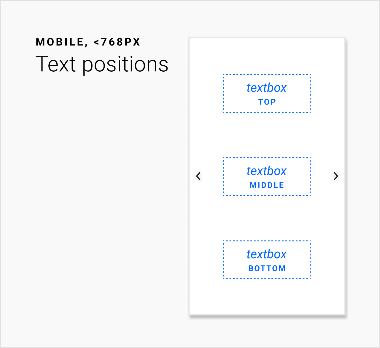
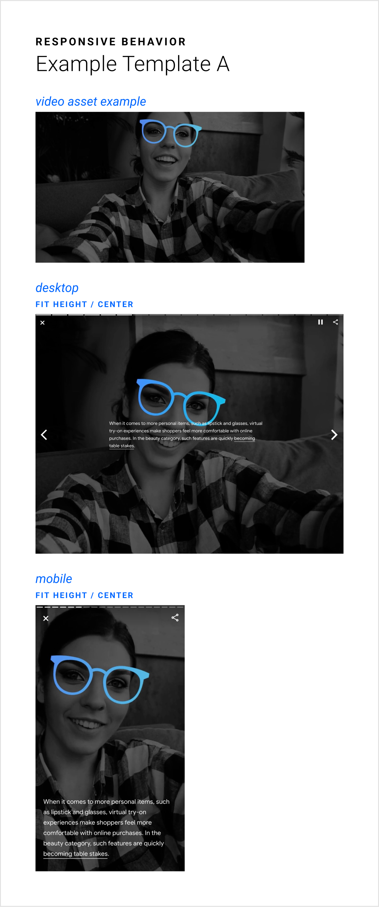
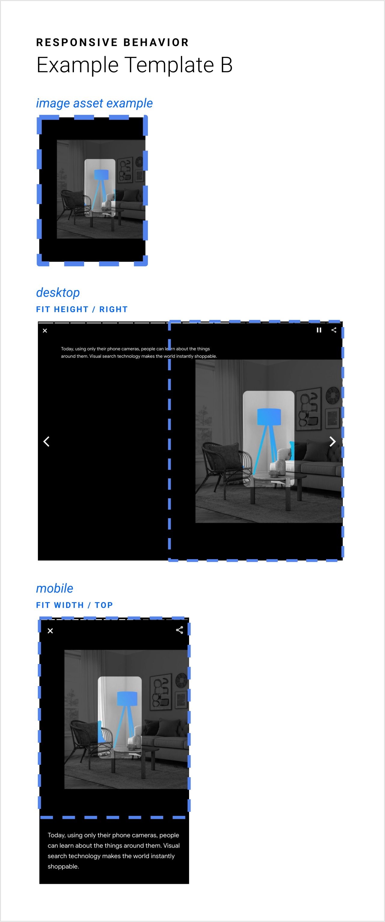
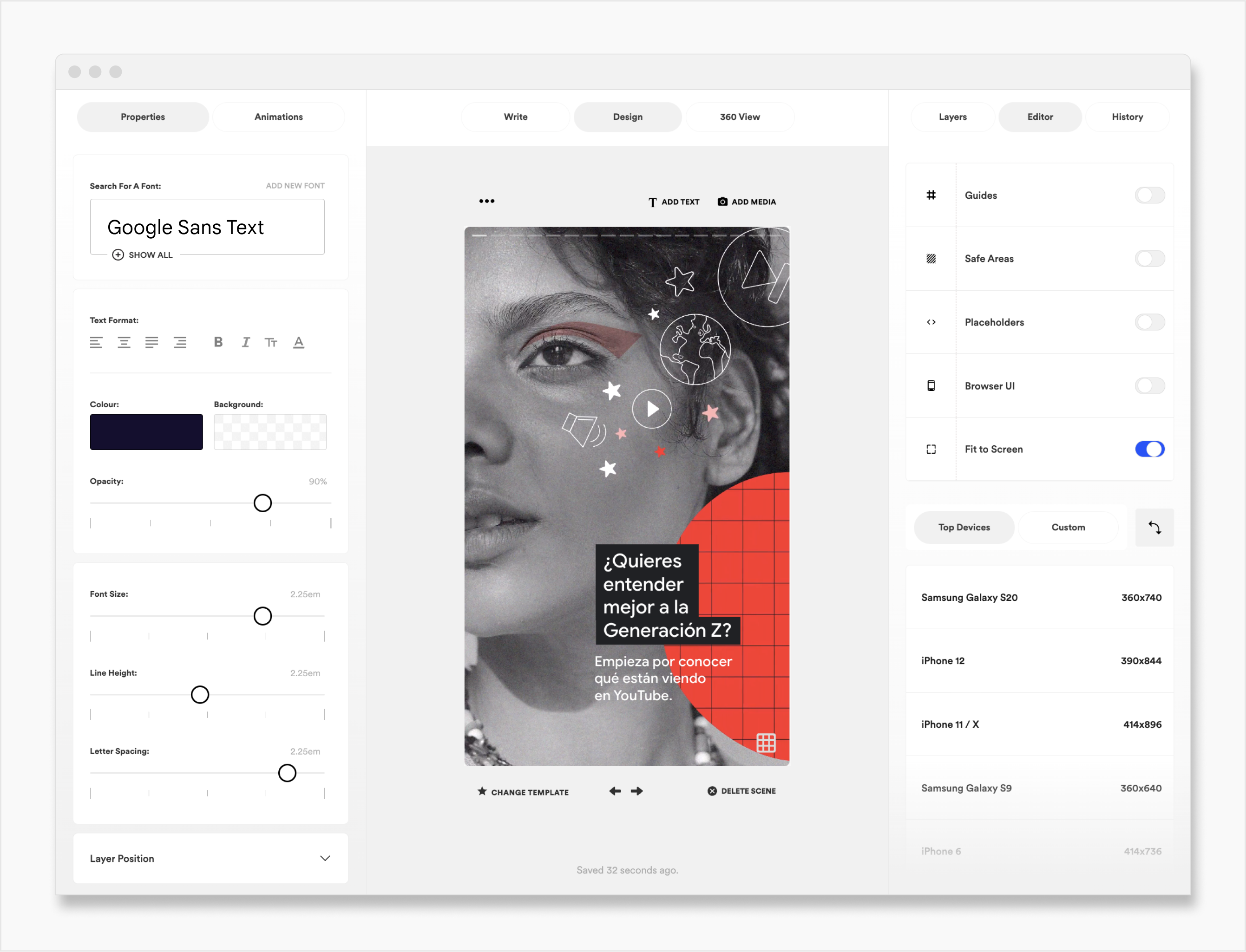
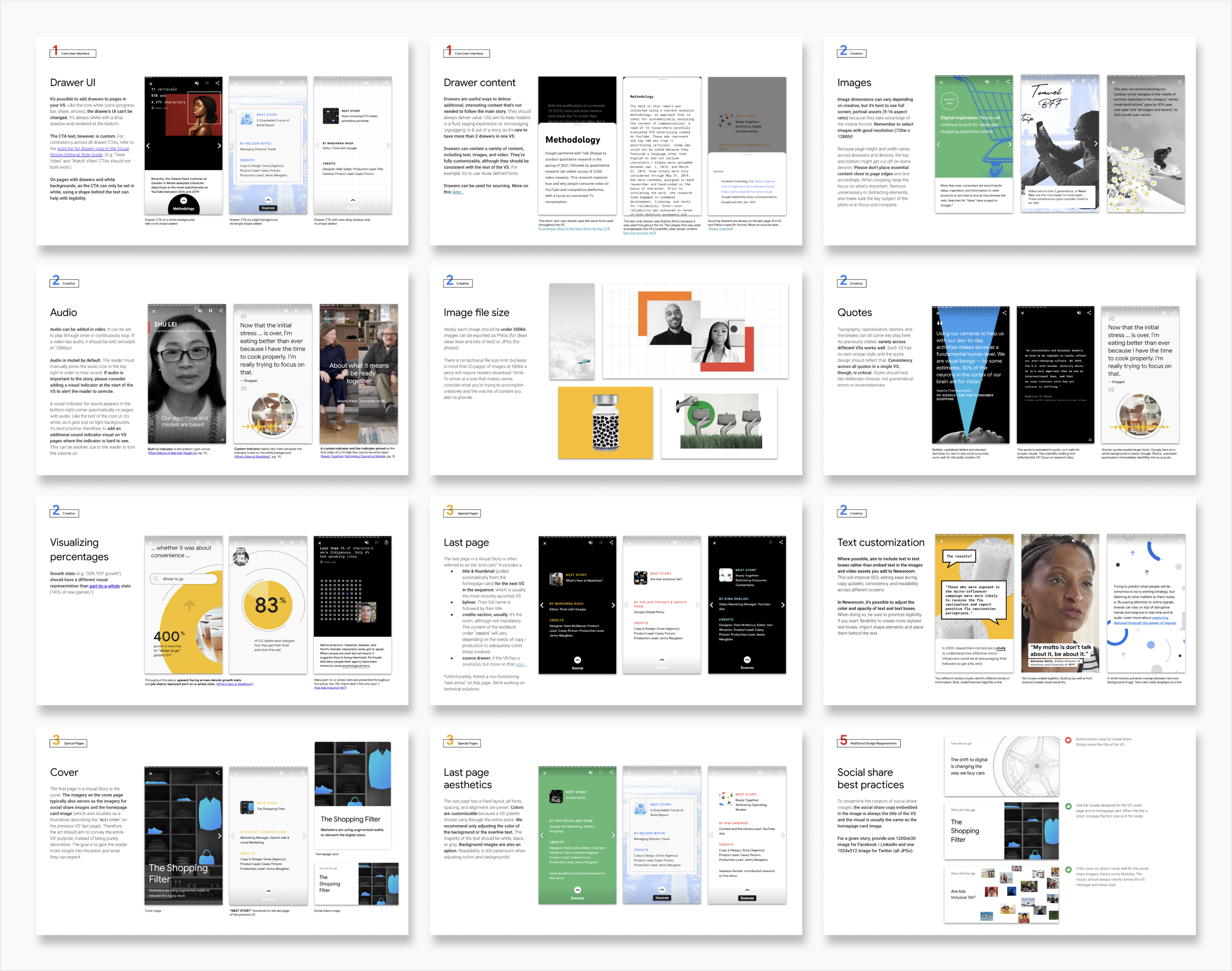
To make Visual Stories easy and fast to launch, we defined guardrails. For example, for text positions, we enabled 9 core options for larger screens: a pairing of a vertical alignment (top, middle, or bottom) with a horizontal alignment (left, center, or right). For smaller screen sizes, we enabled 3 options. We also designed reusable, responsive templates. When designing a page for a Visual Story, designers would simply provide the image or video asset and specify which responsive template they wished to use. We outlined these guides in a “Starter Figma,” the perfect resource for designers kicking-off a new Visual Story. All of these decisions were made in collaboration with the developer as he built the product. It was a balance to build in flexibility for future story designs and to establish simple, streamlined rules.
Visual Design
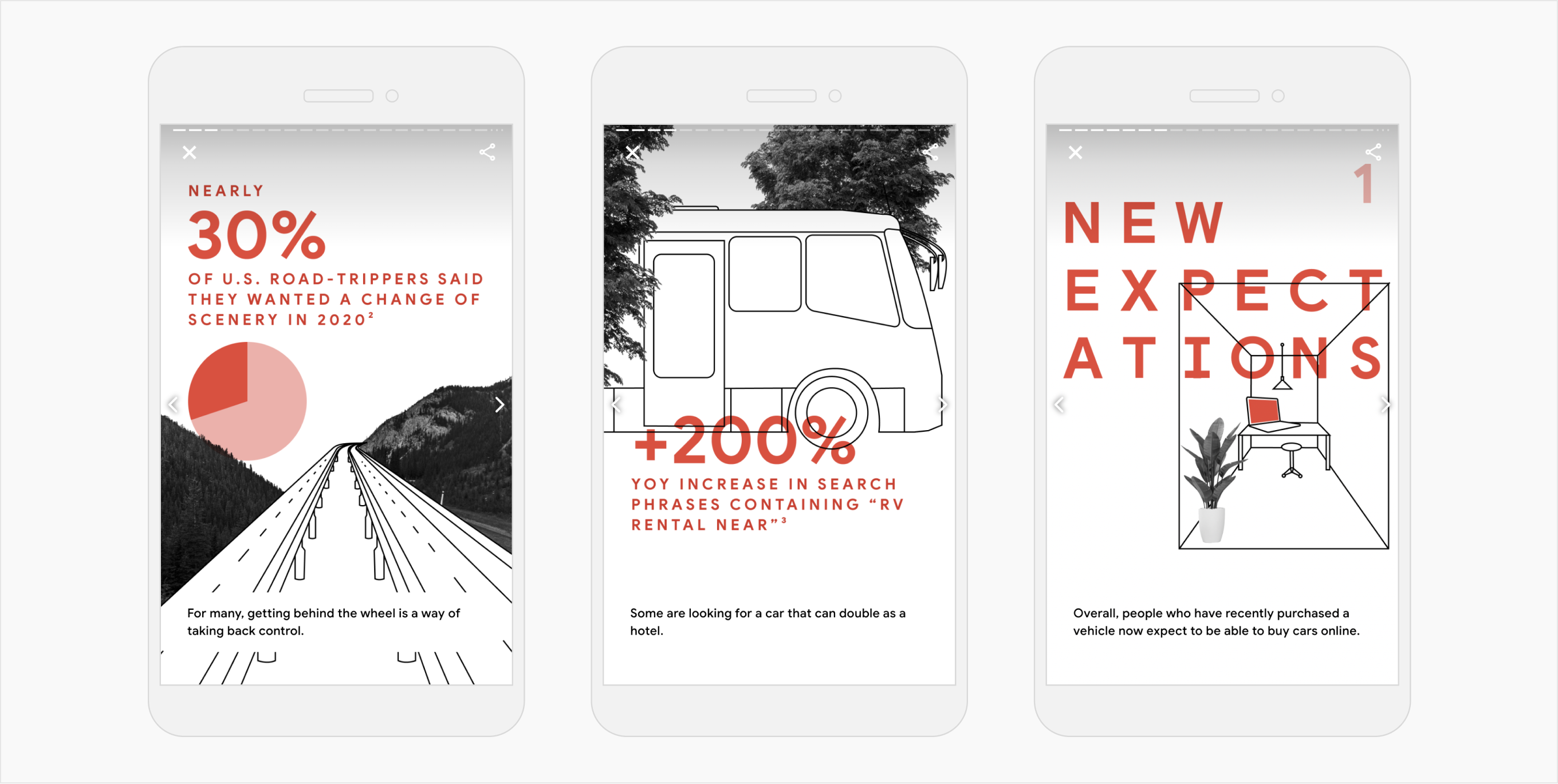
I also owned the complete visual design of a set of Visual Stories, (which put the templates to use). Every story required a substantial creative lift to fill each page with dynamic content. We ensured each piece had a unique visual identity that supported its story conceptually, but still aligned with TwG's overarching brand identity.
Scaling
As Visual Stories took off, we needed to quickly scale. Our original templates facilitated rapid creation, but they were intended to be used by professional designers; they lived in Figma and required an understanding of responsive behavior. Google teams without a design role wanted to make Visual Stories.
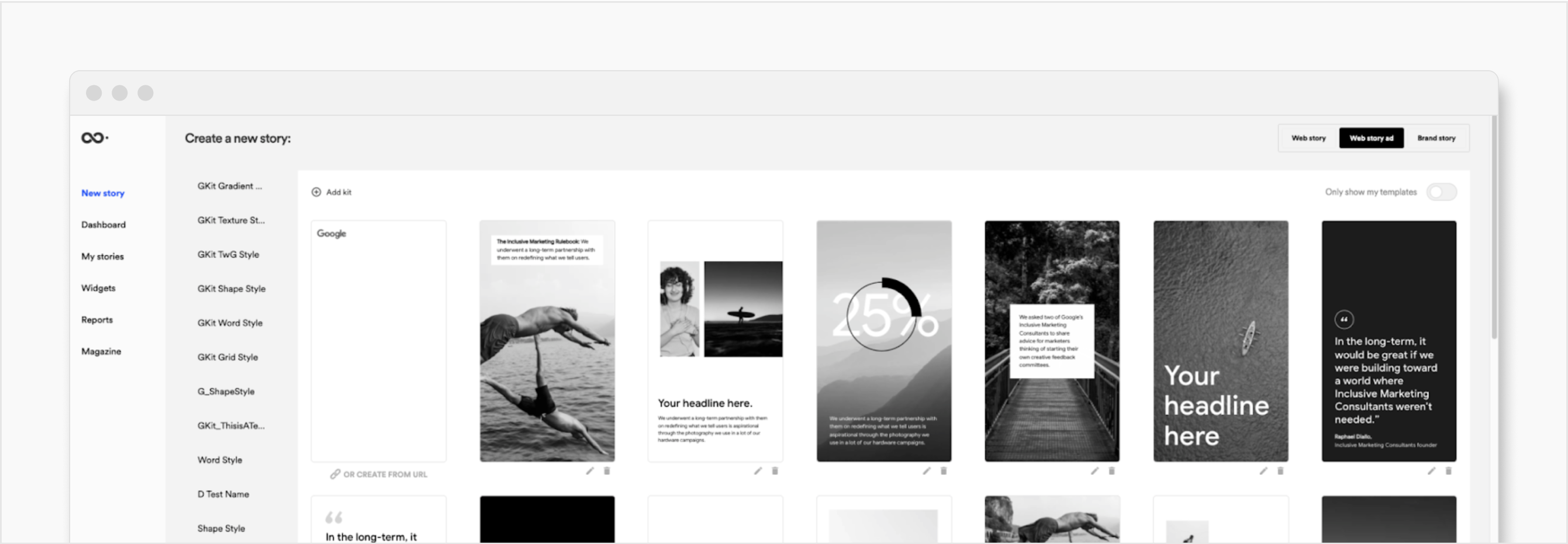
So, we brought in Newsroom, a WYSIWYG editor that empowered non-designers to craft custom Visual Stories. Unfortunately, Newsroom supplanted our custom-built UI with their UI and simplified all future Visual Stories to a mobile-only format. While this diminished the immersive experience on desktop, the efficiencies in article creation were immense. This decision was made easier because the vast majority of TwG users were experiencing Visual Stories on their mobile devices.
As the reach of Visual Stories expanded, our team's design role transitioned from hands-on designing to knowledge-sharing and oversight. To uphold quality standards, we defined visual guidelines in a Style Guide and led creative reviews. To help non-designers get started, we also fashioned templates in Newsroom, where creators could drop in their custom images and text.