JourneyFinder
- UX Design
- 2021
Overview
JourneyFinder is used by 3,000+ Google employees to navigate over 320k customer journeys, consisting of 800M touch-points, across 30 verticals. Beyond empowering Sales and Marketing teams with examples of real journeys, the internal tool enabled core insights in Google's narrative for their $100B Ad Marketing business. These insights were presented in executive keynotes, featured in Think With Google articles (collectively receiving 256k UPVs), and referenced at CES and Shoptalk. I led the tool's UX Design. The timeline was very short—I had a 2-week design sprint to hand-off final designs. (Note: Journey data wasn't internal Google data, but purchased from a third-party where participants opted in to use tracking software in a paid study.)
User goals & tasks
Leading up to the sprint, I joined user interviews led by our UX researcher with internal Sales and Marketing folks. We observed the participants interact with an early iteration of JourneyFinder and learned about the role of customer journeys in their work. This groundwork informed our efforts to define their critical goals and the set of tasks to achieve those goals. Establishing user goals and tasks kept our team aligned and accountable for UX quality as we strove to create a useful and usable product.
Process
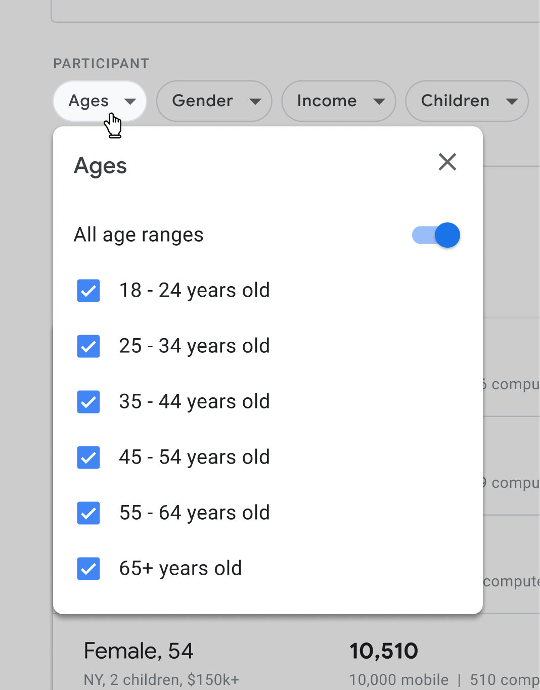
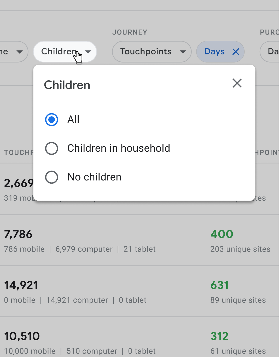
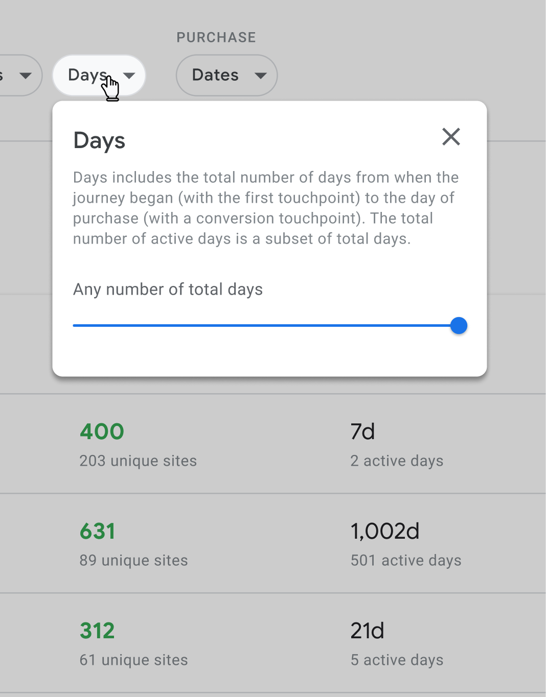
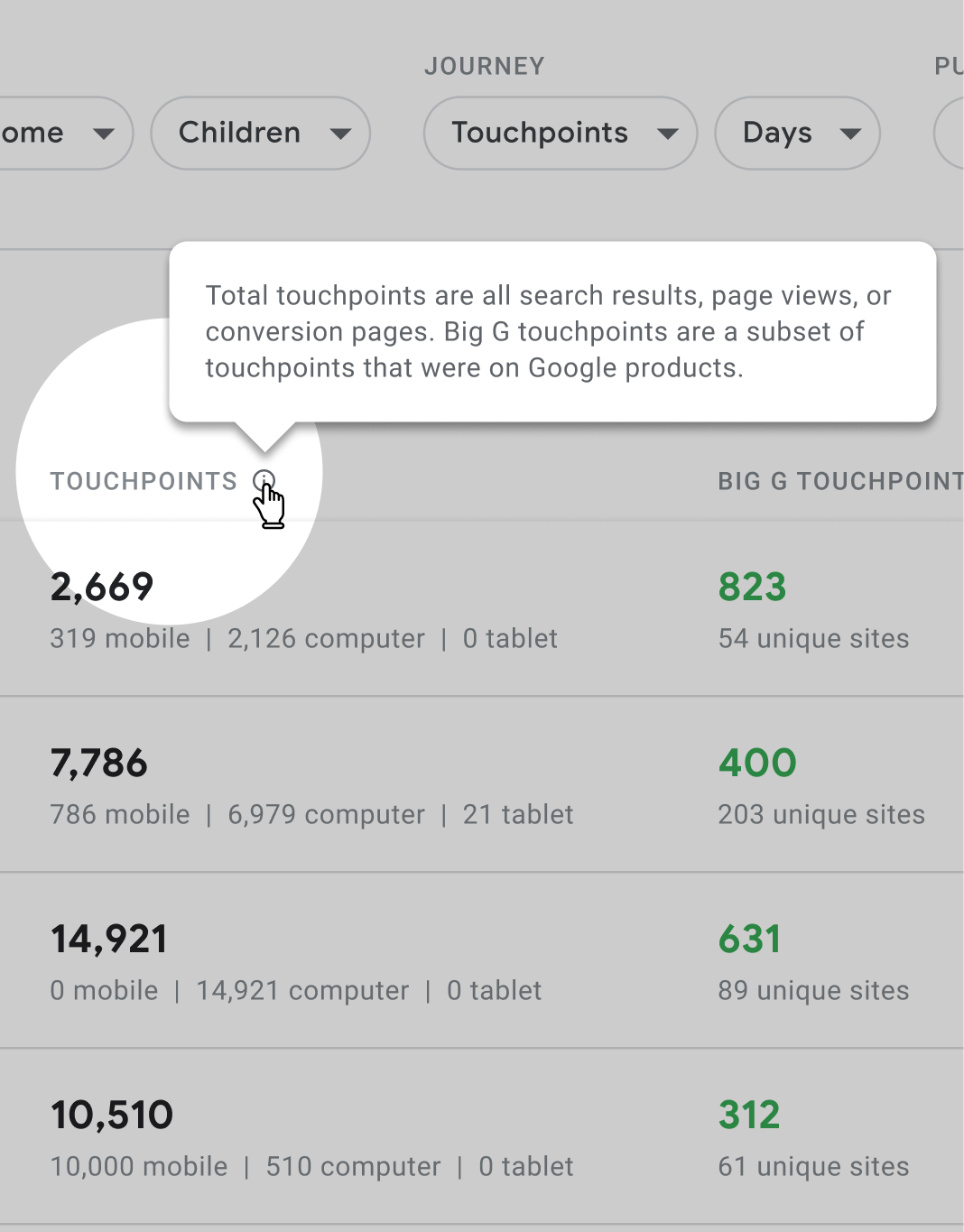
To start, I organized the data attributes in a shared spreadsheet, categorizing and adding notes. The user research sessions had illuminated which attributes deserved priority, paired nicely, worked well for filtering vs. sorting, etc. Our team worked in the spreadsheet together. Engineers clarified capabilities, research fielded user questions, etc. A source of truth, it cemented our shared understanding and was foundational in later decision-making. For example, mutually exclusive attributes translated to radio buttons, whereas attributes supporting multiple choices called for checkboxes. Our attribute descriptions supplied copy for subheads and tooltips.
When the sprint began, I took advantage of established Google resources like their Material Library. Adhering to best practices and utilizing building blocks, I could rapidly shape a sophisticated tool. Without time for usability testing the new tool, it was helpful to tap into Google Flights, an enormously successful and tested Google tool with much functionality overlap. We referenced the live site frequently when finalizing interaction decisions.
Prioritization
Our rapid timeline meant we tabled some features. Our choices were dictated by the value each feature would provide to users and technical effort required. For example, we didn't include filtering results by “Purchase Sites.” User interviews revealed that this would be valuable because clients are often interested in journeys where customers purchase items from their site or their competitors' sites. Unfortunately, this required significant data cleaning, rendering it out of scope.
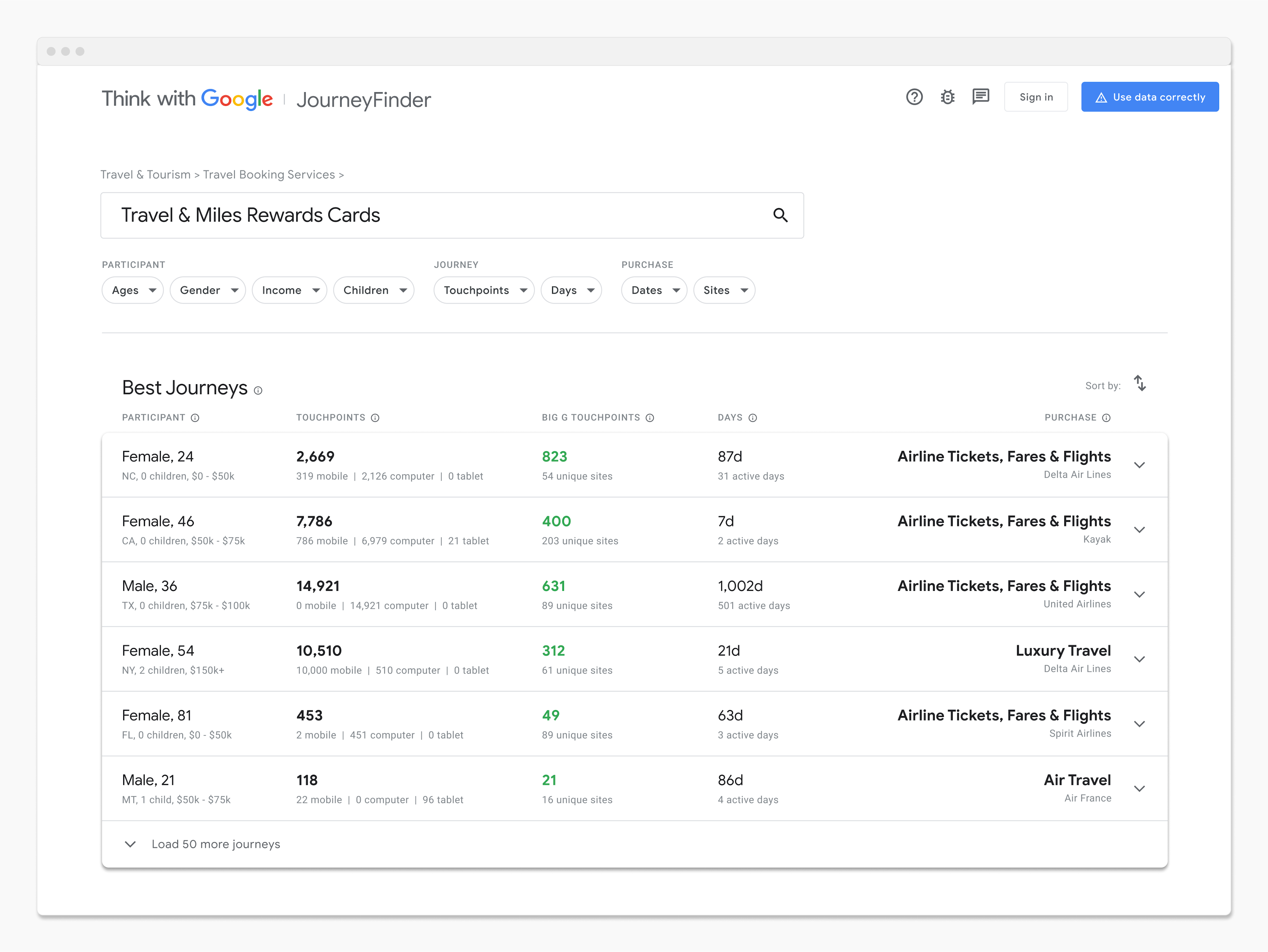
Search
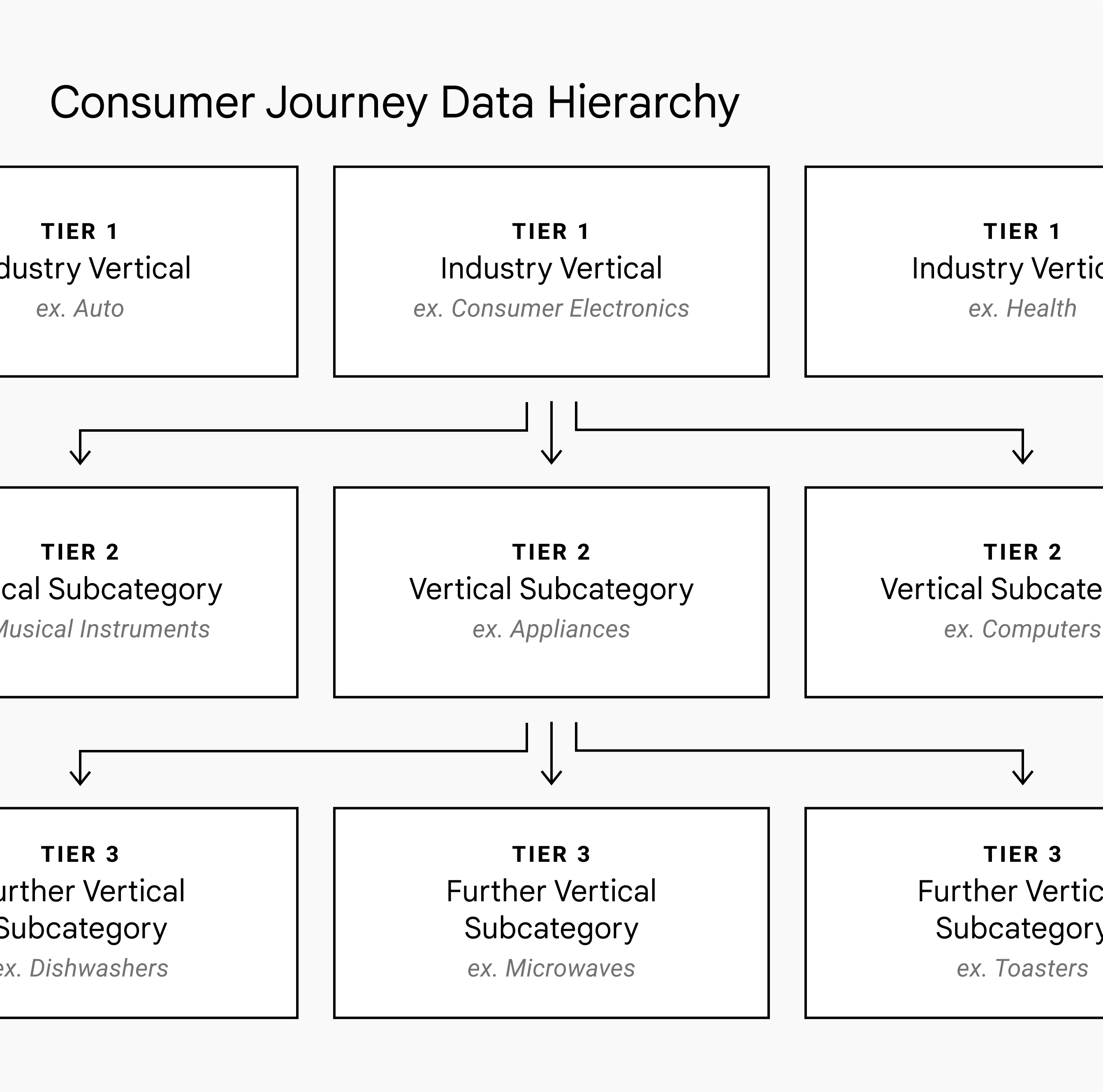
When designing the search bar, we decided to incorporate additional functionality beyond standard global search. The customer journey data had a 3-tier hierarchy. Industry verticals (e.g. Auto, Consumer Electronics, Health, etc.) at the top broke down into vertical subcategories, and again into further subcategories. During research sessions, many users sought journeys pertaining to a specific industry vertical because they largely worked with clients in a particular industry. Therefore, we believed it'd be advantageous for users to be able to navigate the data tiers. We also believed traversing the hierarchy would help users form a mental model of the data.
For a next step, I would have prioritized user-testing on the search bar design as it deviates from convention. In lieu of this, I leaned heavily on best practices outlined by Nielsen Norman Group (NN/G). We applied their advice to always allow users to submit a standard search query. If users search using an industry vertical or subcategory (scoped search), NN/G recommends to explicitly state where the user is in the hierarchy at the top of the results and to enable 1-click access to move between tiers (enlarge the scope). I used breadcrumbs to address this advice.
Team
Product & Engineering: Nathan Beddome; Project & UX Research: Katie Herskovitz; Engineering: Victor Zeng